

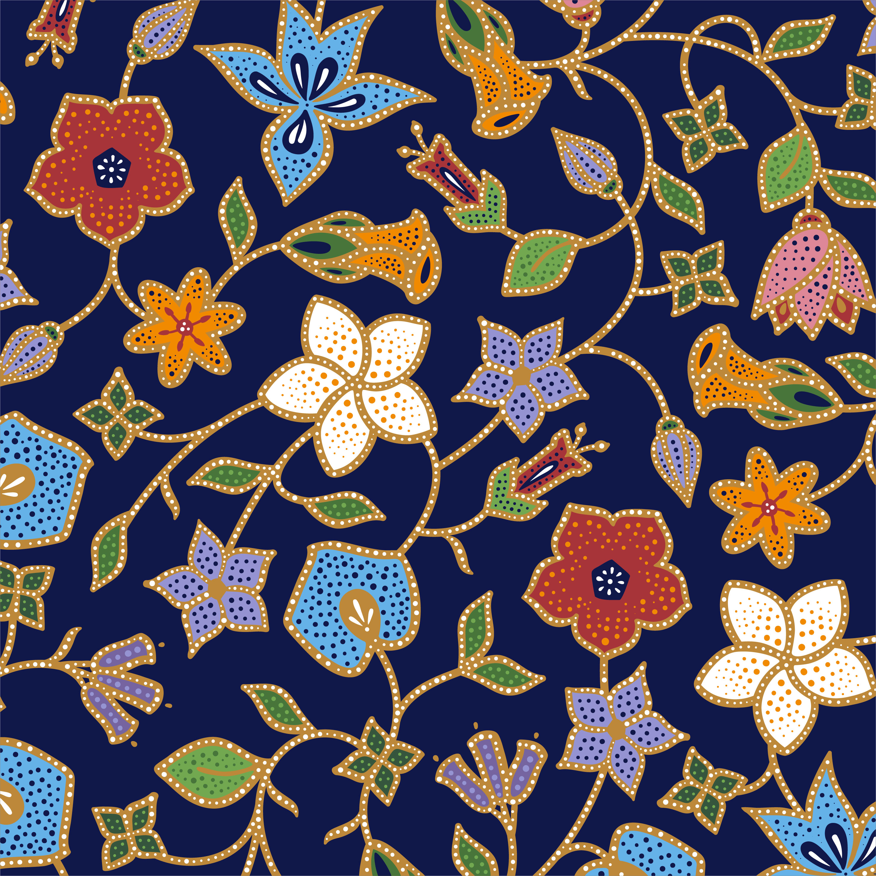
Launched a little over a week ago, Singapore Airlines has refreshed its iconic Batik Motif that is used throughout the passenger journey and brand. Celebrated in a two-minute film, the airline has kept part of its design language current with the most subtle of shifts.
Simplifying what was an elaborate and intricate design, most commonly found on the airline’s staff uniform – the Sarong Kebaya, has allowed the airline to create a pattern that is better suited for digital use as well.
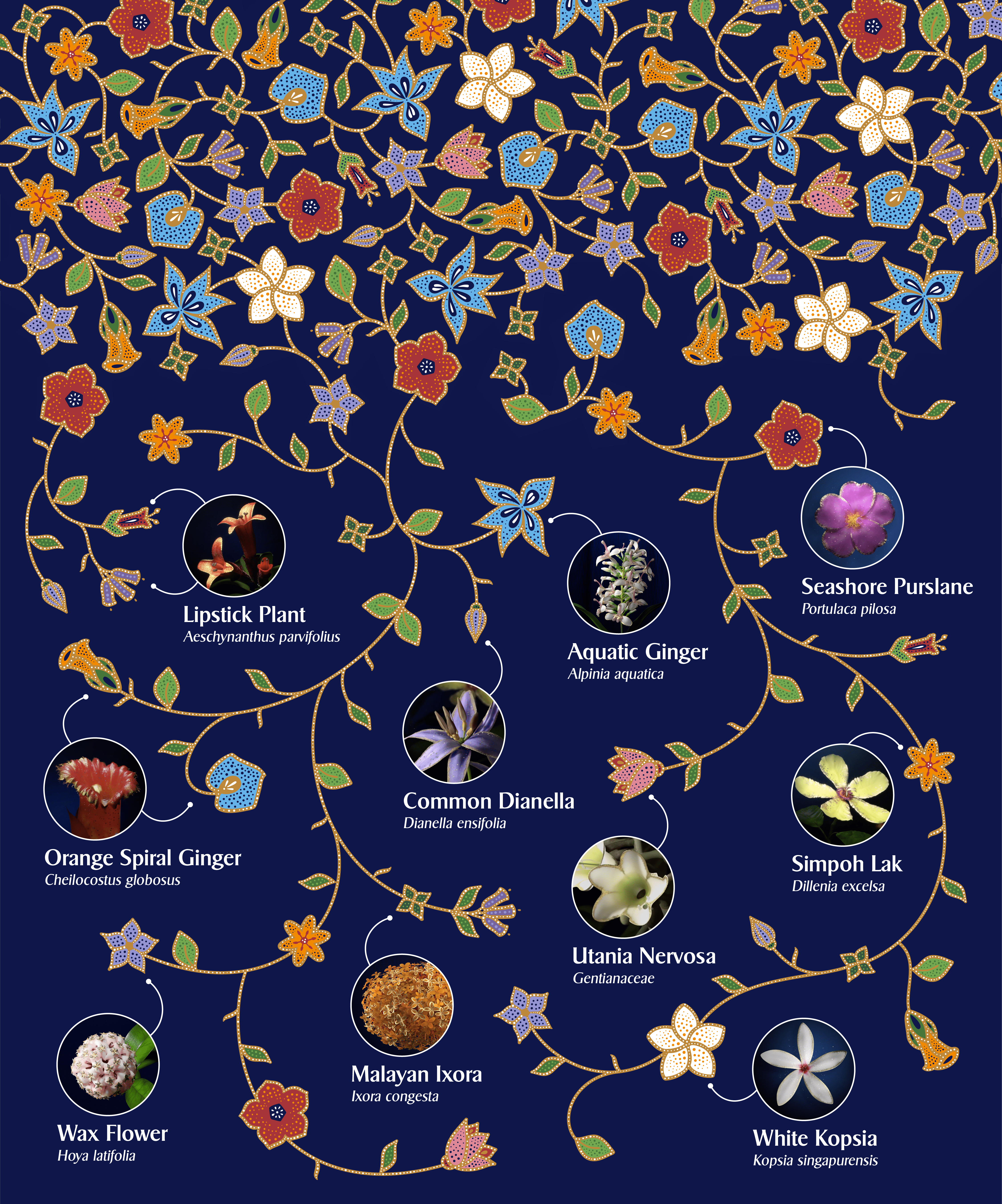
The motif has already been incorporated in merchandise sold on KrisShop and is an important element in the Airline’s branding. While the design draws its inspiration from the original batik motif, the new design focusses on 10 flowers native to Singapore.

It pays homage to both SIA’s world-famous brand heritage and Singapore’s status as a garden city. While it will not replace the original batik motif of our cabin crew’s iconic sarong kebaya uniforms, SIA will incorporate the new motif in upcoming marketing and branding assets. There’s good reason for this deliberate decision not to update the uniform.
While there’s the obvious cost efficiencies in leaving these garments untouched, the design is also a classic Pierre Balmain stalwart, unchanged since 1974.
The airline has also just revealed a new soundtrack, part of the airline’s branding arsenal that helps stimulate all five of the senses, titled ‘The symphony of flowers.’ This is a multimedia brand refresh, that all stemmed from the iconic uniform, that will keep the airline’s future brand touchpoints contemporary and exquisitely elegant for years to come.

There’s the old adage, if it isn’t broken, don’t fix it. And that’s the quiet restrained approach Singapore Airlines has taken, and it’s one of the reasons their brand has become so timeless.

Their attention to detail really is impressive.